loading

Schibsted Marketplaces

White lable product / Global design language

2016 - 2018


The company


Schibsted Marketplaces owns the #1 online classified ads businesses in 18 countries, including France, Sweden, Greece and Brazil, with a reach of over 200 million users.

In early 2016, we began uniting local classified businesses across the world under the Schibsted Marketplaces umbrella. Where businesses had worked on stand alone products for local markets, they would shift their efforts to create a global marketplace platform.


Our challenge


For hundreds years buying and selling has underpinned our way of life. From the market stalls to the digital revolution our buying and selling experience has changed. Most recently we've seen ecomece sites specialise in the one click purchase approach.

Our challenge was to bring the online marketplace back to its roots. To create a strong foundation that embraced a rapidly evolving business whilst still empowered a diverse user base.

Our high level goals were to:

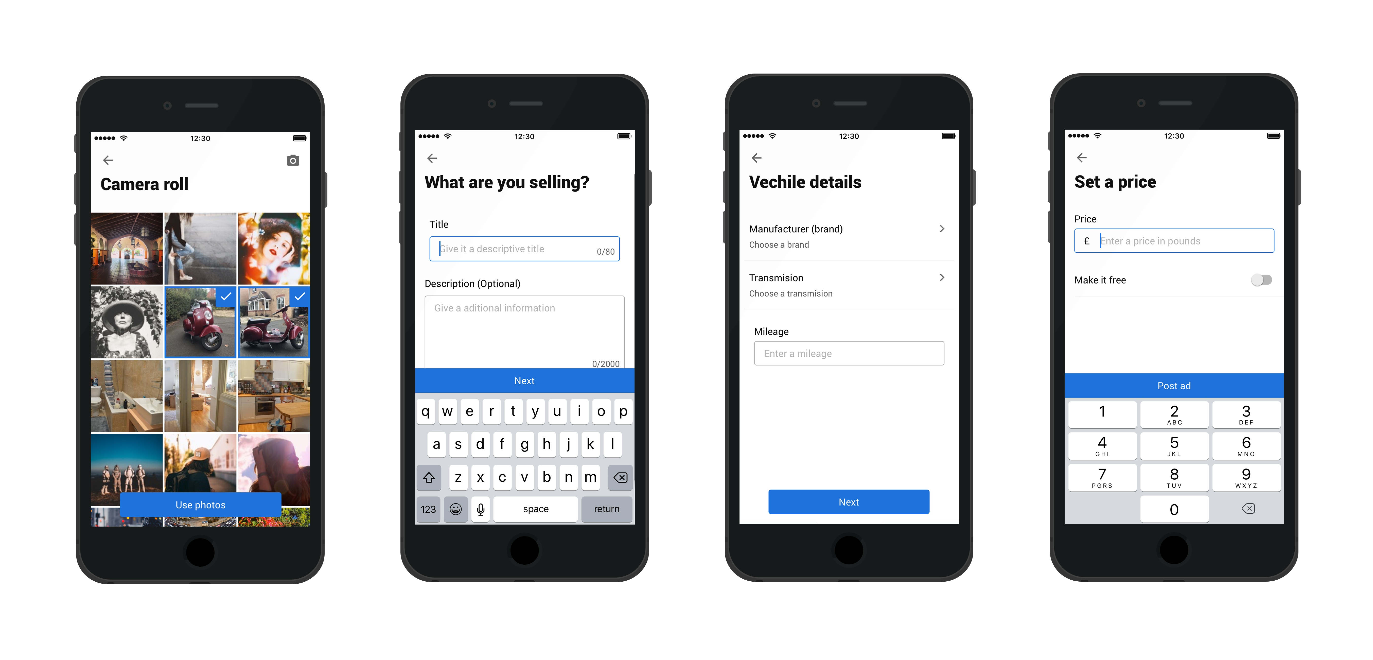
  1. 1. Make selling & buying fast and easy for everyone, everywhere.
  2. 2. Empower customers to create new business.
  3. 3. Create a platform for innovation and deeper engagement.
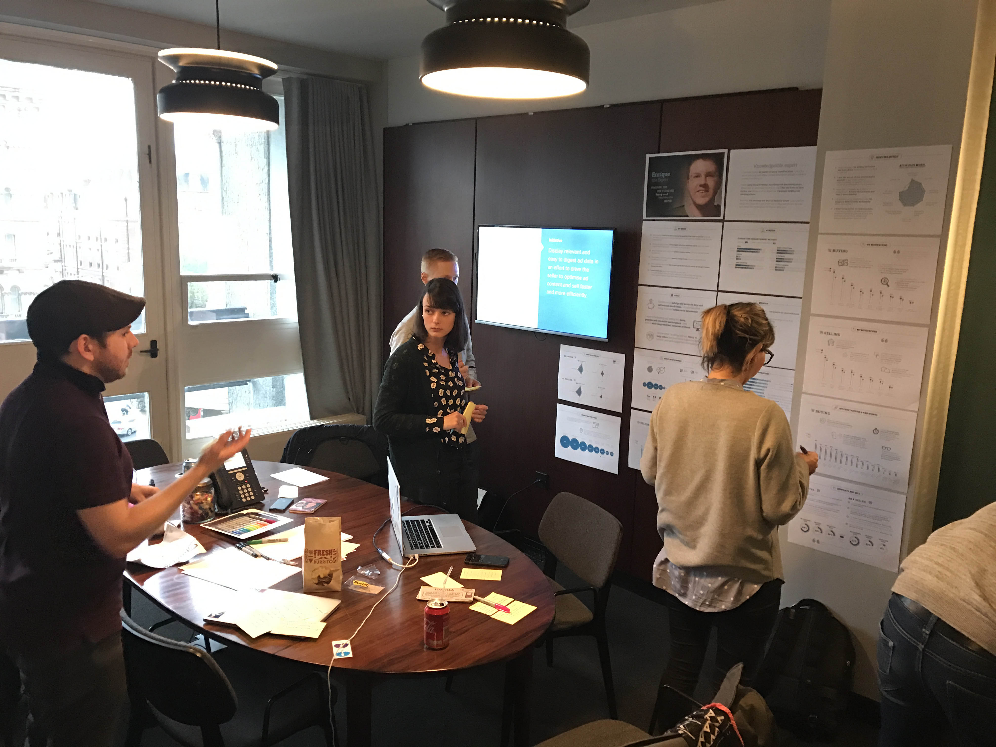
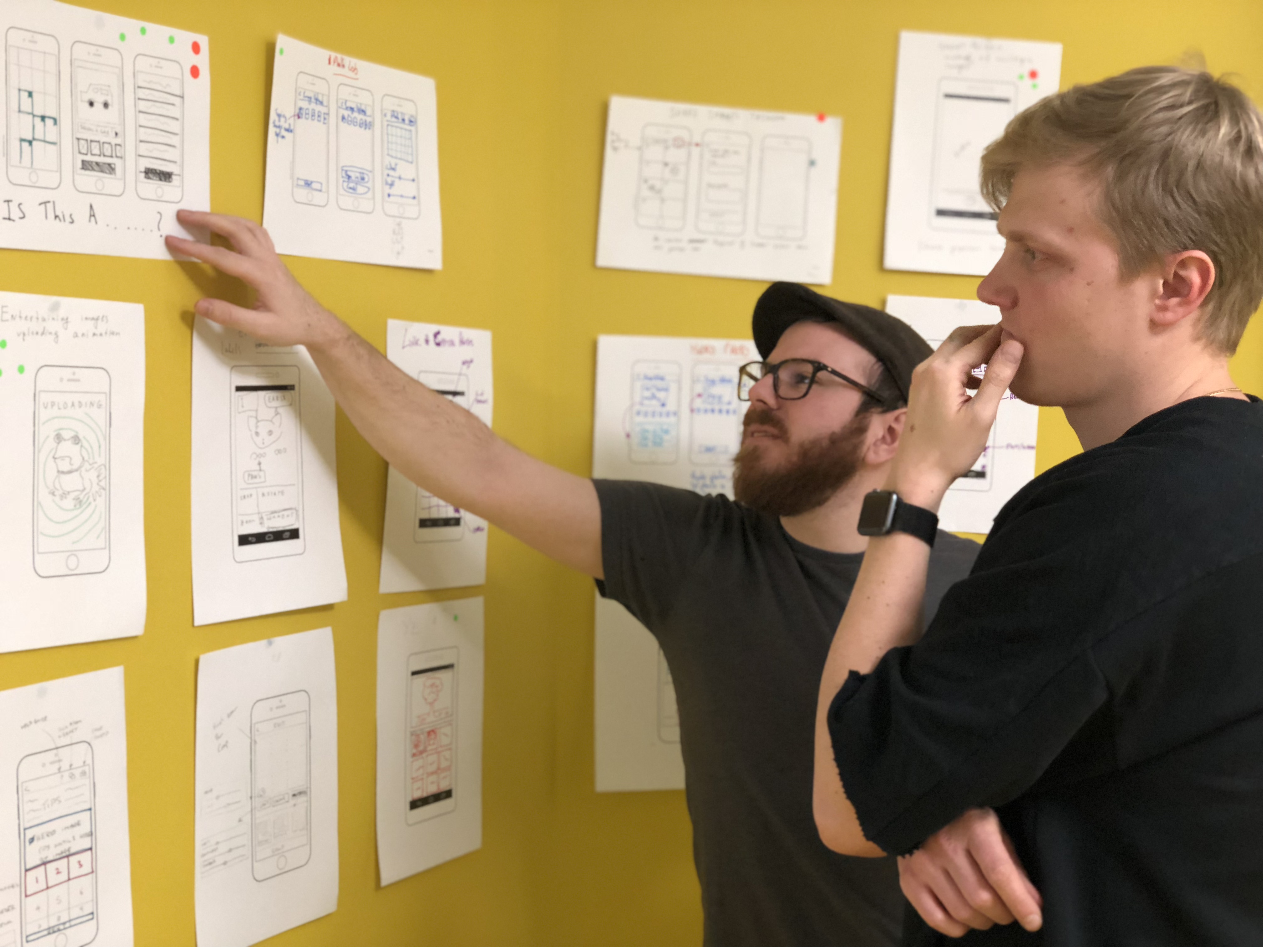


My role


I am the lead product designer for the end to end seller experience of the marketplace platform. I work alongside a product manager and researcher in a full-stack cross-functional team. I measure the impact on beta users in Greece, Dominican Republic, Tunisia and Belarus, to learn and improve the overall selling experience.


The problem on the surface


The MVP launched with a standard one page classified ad creation flow. This decision was reached after direct competitor analysis and existing data from our other business units.

After testing this with a closed group of uers from spesific segments. Data revealed task completion time to be slow and user bounce rate high. In user interviews we found that a substantial numbers of participants mentioned struggling with digest information they needed to provide.

This became the basis of defining the user problem.


Image


Understanding our users


Using our eight defined user segments we analysed the ad creation flow. The goal being to understand more about how well it fitted to our user needs and goals.

Working through each segment we found very different needs and usages. We notied that if the experience could be taylor spesifically for each case it would remove a lot of friction.


Image


Mapping the journey


To help cerate a solid foundation for this, I used our user needs, direct competitor knowledge and 8 existing products flows as guidance. Working with the user researchers I mapped out the user journeys in three different instances:

  • Direct competitor flows
  • Existing internal product flows
  • Flows based off user segment needs


Image


Ideating on the problem


Using a condensed version of the Google design sprint, I ran an ideation workshop to dig deeper and unlock ideas from all members of our feature team. This gave an improtant opertunity for all members of the team to contribute ideas. Some of the best ideas tend to come from the most unlikley of places.

The workshop consisted of 12 participants from a mixture of profesions UX, product, engineering. This sinergy between cross different disciplines led to a wide range of ideas.

It became clear that a taylored flow that could change based on spesific user needs would be best. With a modular flow we could potentially remove unwanted information for spesific love value sales such as clothing but still add steps for higher value sales such as cars or houses.


Image


Early insights


With this spesific project I was keen to push into cognitive load reduction. I found that if you reduced the number of fields to a maximum for 4 per view it dramatically increased the speed of information retention. Giving us on average 20% faster end to end ad creation experience than your standard one page form.

Image

Showing user path in handover documents give developers a strong visual understanding of the users route. This also saves time as this can mostly replace the key paths with the original user flow map.


Image


User testing


User testing gives real world qualitive feedback and is a great way to get into the head space of ones users. Traking the users interaction with the device is key to understanding where things may need to be improved. It's also a good idea to keep a look out for the users facial expressions and focus areas.

Image

This is a great time to get the whole team involved writing noted on any pain points for the user or potential new exploration areas. There is a noticable increased in user empathy from team when they are involved in these excersise.


Image


Future vision


We are currently exploring live image recognition using the devices camera. Processing the camera feed in real time to help users find new products to sell. This data would be hooked up to a price comparison tool and also driven from real time market sales data.

Image

An exploration into increasing ad creation speed. Using one piece of data (Photo) to complete the whole ad creation process.

Image
Generic placeholder image
Jon Bunday

Senior Product Designer

March 01, 2018